artworks, artists and exclusive offers. Sign up now
[CURATION] Designer Series | Accent Color for Definition
June 3, 2021
Designer Series | Accent Color for Definition
by SAL McINTYRE
Designers of all kinds know the value of working with an accent color, as its uniqueness in the landscape of a project serves to feature the best qualities of the work and convey the overall character in a standout way — a highlight singing atop the foundation. As for interior design, using the choice of artwork to both compliment the style and project the voice simultaneously can be a magnetic combination, and a way to really tie the room together.
Works by Christo are an obvious go-to, as they frequently utilize this concept as one of their main focal points. This piece The Gates XXVII, with its black and white backdrop scheme, shows the brilliance of the infamous saffron colored installation in New York’s Central Park from 2005.
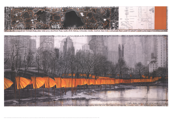
Javacheff Christo – The Gates XXVII, offset lithograph 2005
Warm reds and ochres flatter the greenery that perhaps already exists in a room full of plants in this Rothko Untitled, #15, a dreamy co-mingling of these two opposites that have enjoyed a long history together on the canvases of many beloved artists, popularized by visionaries like Van Gogh.
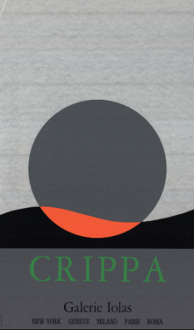
Roberto Crippa uses simplicity to his advantage, needing no more than shape and color choice to do all of the talking. This 1970 silkscreen Galerie Iolas has the drama to speak confidently and the softness to agree with any design elements already in place.
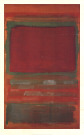
Mark Rothko – Untitled, #15, offset lithograph
Roberto Crippa – Galerie Iolas, silkscreen 1970
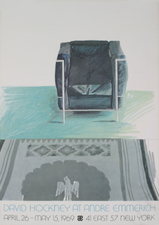
Hockney’s Corbusier Chair and Rug nods at that oxidized copper green that seems to fill everything with romance, wielding the potential to converse with truly any metal that is used in the space, from kitchen fixtures to window trim.
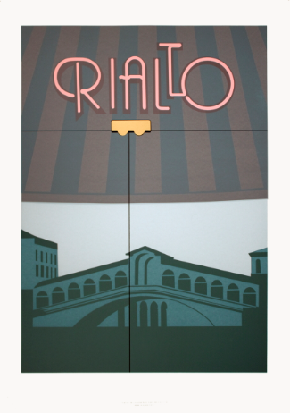
Rialto by Perry King, a 1984 silkscreen, retains the quiet atmosphere of a long-shadow summertime dusk while allowing the faded pink of the neon sign lettering sweep the mood with nostalgia and dwindling daytime boardwalk energy.
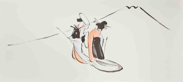
Jichosai – Chushingura, offset lithograph 1992
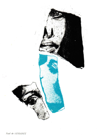
Turquoise mingles with subtle black flecks in this gorgeous 1967 stone lithograph work by Paul de Lussanet, Untitled Composition. This intriguing piece derives from a small art publication of first edition lithographs titled The Situationalist Times: International Parisian Edition, the sixth and final issue produced in the spring and autumn of 1967 and featuring artists from the renowned CoBrA and Figuration Narrative movements.
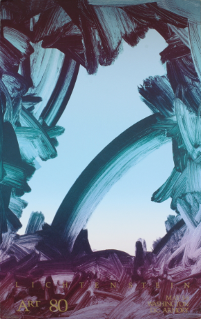
Paul de Lussanet – Untitled Composition, stone lithograph 1967 Gary Lichtenstein – Art 80 Washington DC, SIGNED offset lithograph N.R. Farbman’s Redwood Forest is nature’s exposé of these famously soothing peaceful giants, and Sheila Metzner’s Flower is a true understatement, the soft demure tulip lending its own individual definition of elegance. |
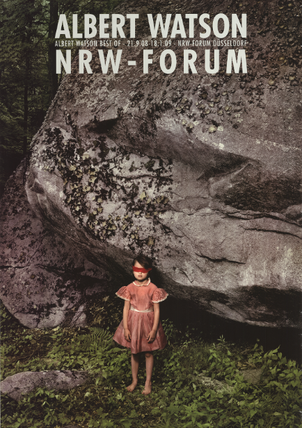
Albert Watson – Child 1, offset lithograph 2008
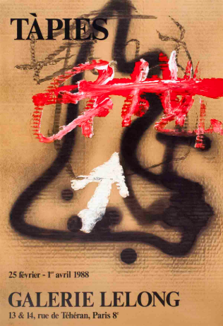
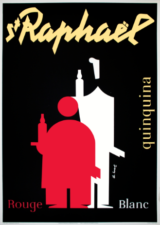
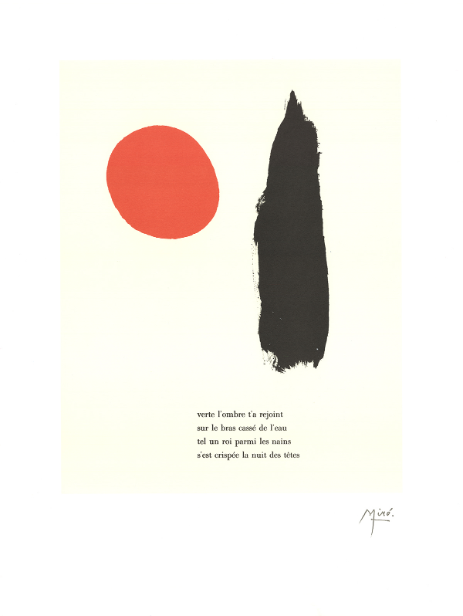
Joan Miró – Illustrated Poems - "Parler Seul" V, stone lithograph 2004

| Prev | [NEWS] New Survey Suggests 15% of US Museums Could Close Permanently |
|---|---|
| Next | [CRITIQUE] 심현섭: 공공미술 6/ 매체의 경계 해체: 크라우스의 확장된 장 |
| List |
